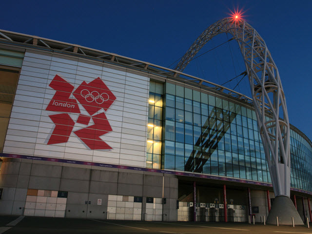
There have been many books and articles written about the logo design process, yet it is still a subject that is open to much debate. A logo that looks great to one person may look terrible to another person. That is why logotype development can be such a controversial process.
You only have to think back a couple of years for a great example of how a logo design can polarise opinion quite strongly. The London Olympics of 2012 were a great success but the design of the logo received a much more mixed reaction. Many people hated it and, for some, it was the “London 2012 Olympic Logo Disaster”
How to design a fantastic logo
Putting together a fantastic logo design is far from simple, but sticking to the few tips that we discuss below will help ensure that you end up with something memorable. Let’s take a look at some of the most important elements of great logo design:
Consider your target audience
The best kind of logo is one that the target audience finds to be appealing. The way that your audience perceives your company can be shown in the design of your logo. Something that you should consider before starting the design process is doing some research within your target audience so that you can get an idea of what they would like to see. This makes sense when you consider the importance of your brand. Creating a logo that goes against the message you are trying to deliver can be a little confusing to the people you are trying to reach.
Sketch your ideas
A big part of the conceptualisation process takes place when you start sketching your logo ideas.
The best way to do this is to commit your ideas to paper before you start tinkering with design programs on your computer. Even the designer that make their living creating logos still sketch their ideas on paper before getting started on the computer. Advanced programs like Photoshop are an invaluable resource for logo designers, but the best results still come when the sketching process is used first.
Steer clear of trends
One trap that some logo designers fall into is imitating logos that have become popular. While this can sometimes result in a great design, it more often than not ends up looking like a cheap imitation. The best designers understand that adopting a herd mentality can stifle creativity, leading to designs that fail to impress. Making sure that a logo design is unique is the best way to make sure it will stand out.
Don’t forget typography
There may be no element in logo design more important than the choice of typography. In recent years, it is a simpler typeface that has become the norm when creating a logo.
Make sure your logo is in vector format
Your finished logo will likely end up being used on a wide variety of products, from business cards to billboards. Another common design mistake takes place when designers create the logo in raster format. When the logo is resized, the image quality is affected negatively, which is not something that happens with a vector image. You can size that type of image up or down and ensure that the quality remains the same throughout.
Photo: Image courtesy of Mick Baker on Flickr

